
Klook: Simplifying travel itineraries for U.S. audience
Context
Context
What is Klook?
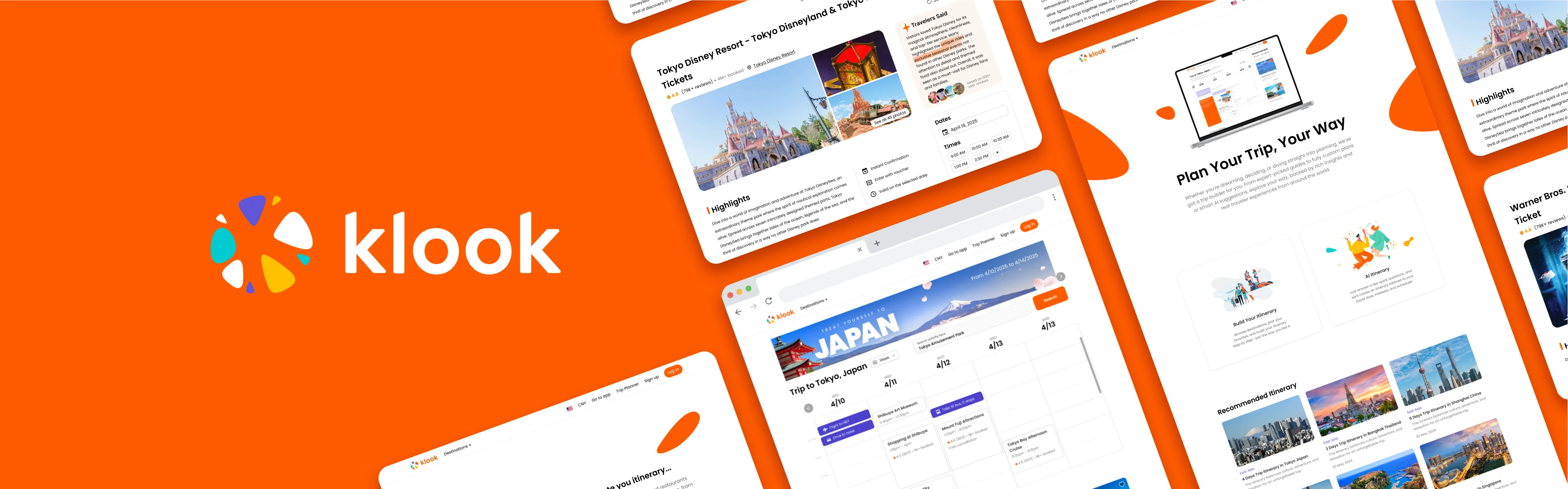
Klook is one of Asia’s leading travel and experiences platforms, helping people book attractions, tours, local transportation, and activities worldwide. To support Klook’s expansion into the U.S. market, I worked as a product design consultant with Design Consulting at Cornell to localize the platform for U.S. travelers before and during their trips.
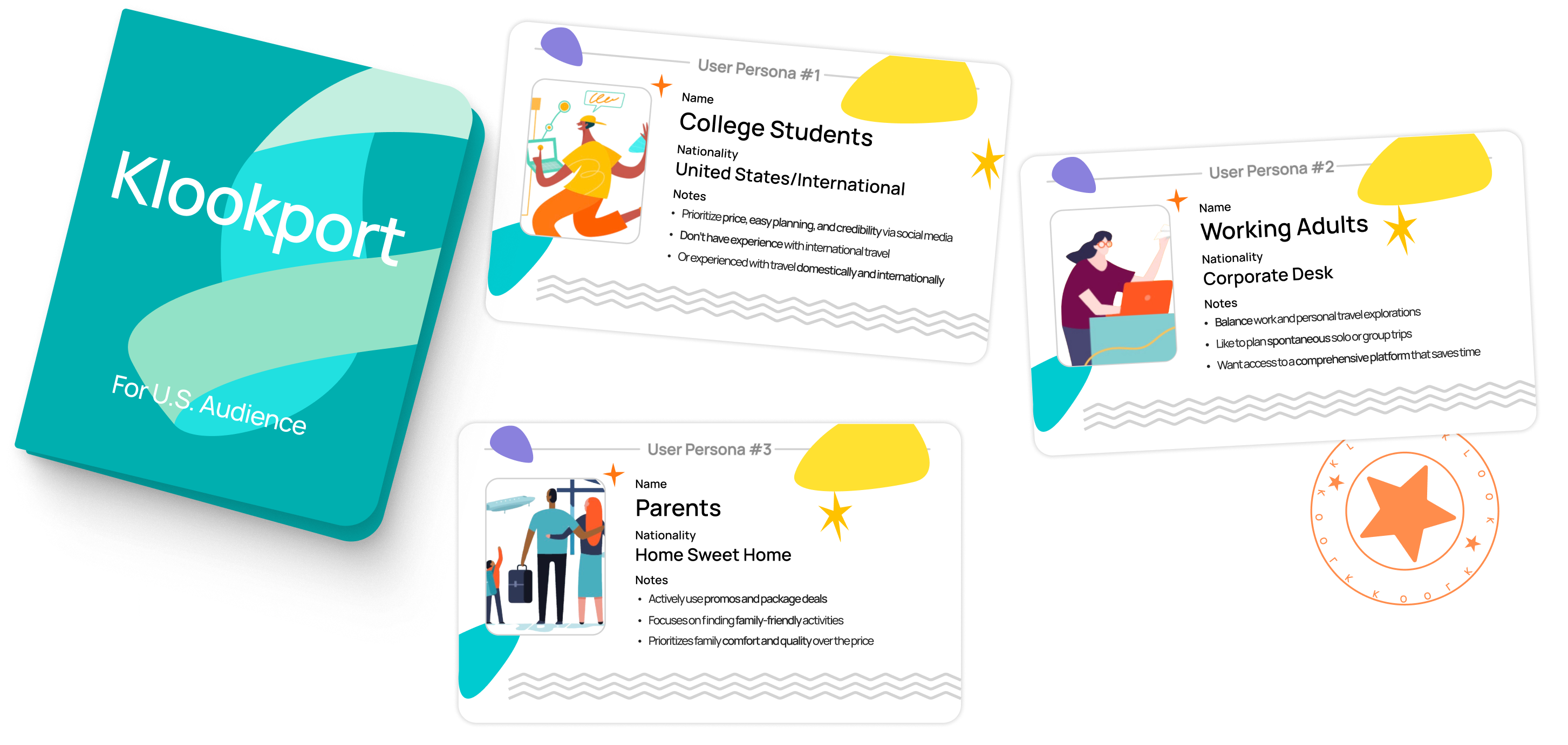
Klook’s U.S. market consumers
My Design Challenge
0→1 Itinerary Feature Design
Many Products, No Centralized Plan. Klook offers everything from tours and transportation to dining, but travelers have no single place to organize those bookings into a trip. Our goal was to create Klook’s first itinerary-planning experience for the U.S. market, helping travelers discover, compare, book, and manage their plans in one place.
Our team divided the product into focus areas, with each designer owning a page. I led the 0→1 design of the itinerary experience, focusing on schedule visualization, personalized recommendations, and clear guidance. I also supported the broader project through weekly standups and design feedback.
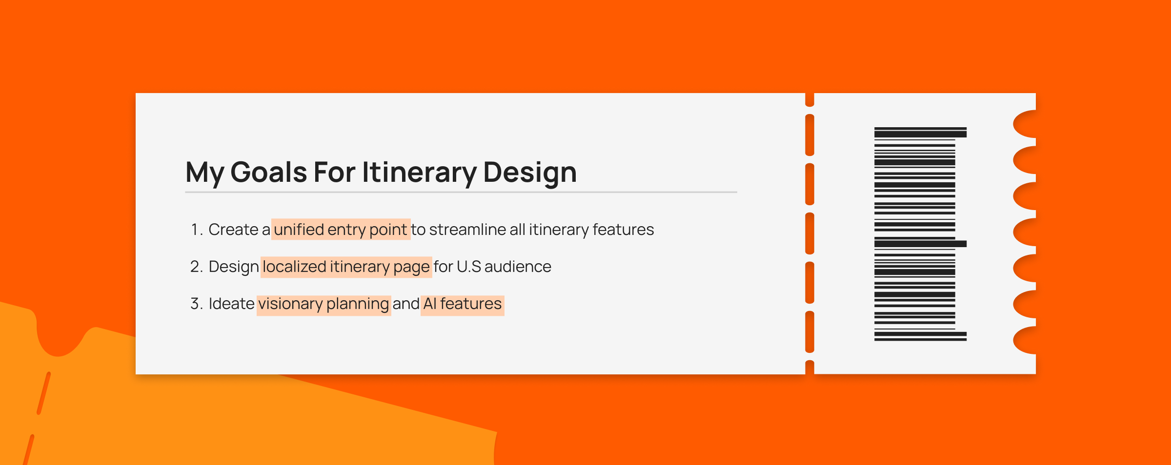
My goals for itinerary design
Final designs
Final designs
1. Build Your Own Itinerary
Travelers can start from the main navigation and manage every booking, destination, and day from one centralized trip page. A calendar keeps the whole trip visible, with drag-and-drop controls for rearranging activities.
2. AI Itinerary
A guided onboarding flow collects trip basics and personal preferences to generate a personalized starting itinerary. Travelers stay in control by replacing or removing individual suggestions without rebuilding the whole trip.
3. Klook Blog Post
The Klook blog post is reorganized into a cleaner, more scannable daily guide. Horizontal attraction cards connect travel inspiration to bookable activities and make comparison easier.
Research
Research
There’s currently no centralized tool to help manage all their bookings in one place.
Klook has over 30 million users and lets people book activities and view them, but there’s currently no centralized tool to help manage all their bookings in one place. After literature review and competitor analysis, I found out:

Higher User Retention
Booking.com reported that users who engaged with trip management tools (e.g., saved itineraries, trip planners) had a 25–35% higher return rate for future bookings.

Improved Conversion & Upsell Opportunities
Users are 42% more likely to book multiple services (flight + activity + hotel) when they can manage them all in one place (Expedia Group).
Competitor Advantage
Major U.S. competitors like Tripadvisor, Booking.com, and Expedia all offer centralized tools to manage bookings. This sets a clear user expectation in the U.S. market, making localization essential.
From 27 User Interviews, We Identified 4 Pain Points
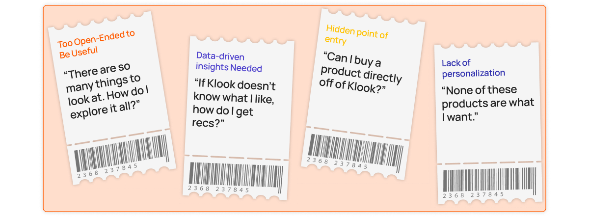
Separated entry point for itinerary-related features
Klook also offer blog-style itineraries with local recommendations, but these booking and itinerary features are spread out across the platform, which can make the experience feel a bit disconnected.

Ideations
Ideations
Initial Ideations for Itinerary Page
After looking into all the itinerary-related features on Klook, I sketched low fidelity wireframes for three main features: recommended for you(which is current Klook blog post), build your own itinerary(centralized tool to manage trips), and AI itinerary for personal recommendations.
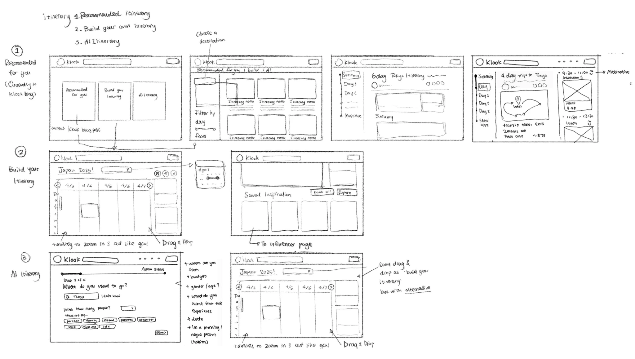
Balancing Vision and Feasibility
During bi-weekly client syncs, the project managers and I presented my designs and gathered feedback on vision and feasibility. While AI-generated itineraries were exciting, they weren’t practical in the near term. An impact-feasibility analysis led me to prioritize “Build Your Own Itinerary” while still developing the other two concepts.
Design decisions
Design Decision
Entry Point of Itinerary
My team discussed and reorganized the information hierarchy of the homepage and navigation bar, and decided to add “Itinerary” in the navigation bar due to its importance and frequent use.

Date & Destination Selection
Before users start planning their trips, they’re asked to enter basic information such as travel dates and the number of people. To improve the onboarding experience, I iterated on the flow to address information hierarchy and reduce cognitive overload.
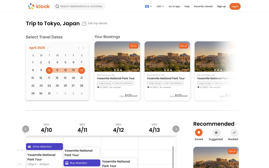
 Increased cognitive overload
- Requires users to scroll to access the calendar
 Avoids an extra step of clicking on ‘next’ button
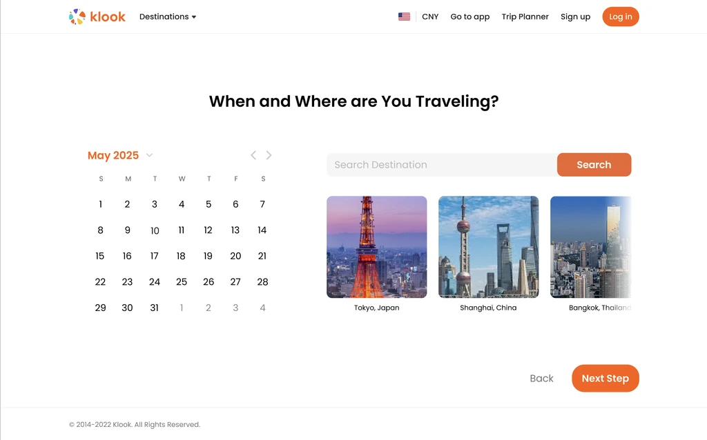
- Step-by-step flow reduces cognitive overload
- Clean layout, aligned with U.S. user expectations
- Visually highlights destinations with images
Chosen direction: Separate Onboarding Page
I chose a separate onboarding page to give travel dates and destinations a focused step before trip planning. Although it adds a “Next” action, it keeps the calendar easy to find and lets users work through setup one step at a time.
Trip Specific Onboarding Questions
For the AI Itinerary feature, Klook will ask a few additional questions to personalize trip suggestions. I explored on different input methods to make the process smoother and more engaging for users.
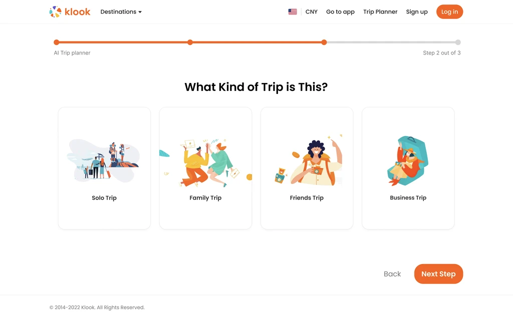
- Visually engaging and intuitive
- Encourages quick decision-making
- U.S. users preferred simple illustrations in tests
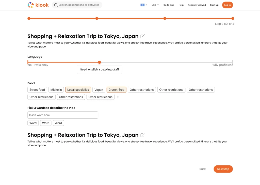
- Visually dense and potentially overwhelming
- Text fields require more effort from the user
- Supports flexible, user-generated inputs
Chosen direction: Card-Based Trip Type Selector
I chose the card-based selector because U.S. users preferred simple illustrations in testing, and selecting a card requires less input than writing a response. I accepted less flexibility than open-ended text to make this step easier to scan and complete.
Impact
IMPACT
Where the project landed
We concluded the project with a final presentation to the Klook client, bringing together the final designs and the reasoning behind our decisions. We then shared the design files as part of developer handoff to support the transition into implementation.
Some features are currently being implemented. The itinerary work lays the groundwork for a more connected planning experience for U.S. travelers, bringing bookings, daily plans, and personalized recommendations into one place.
Reflections
Reflections
What I learned
Feasibility is part of the design problem
During our bi-weekly client reviews, AI-generated itineraries raised near-term feasibility concerns. I prioritized Build Your Own Itinerary while continuing to explore the other concepts. I learned to define a practical starting point alongside the longer-term vision.
Personalization should leave room for disagreement
In the AI itinerary flow, I included controls to replace or remove individual suggestions. A traveler’s answers give the system a starting point, but cannot capture every preference in the moment. I learned that giving users a way to correct a recommendation is part of personalization.
Localization means questioning familiar assumptions
When comparing onboarding inputs, U.S. users preferred simple illustrations. That feedback helped me choose cards over a text-heavy form. I learned to treat localization as a question of interaction and effort as well as language.